$329.00
Description
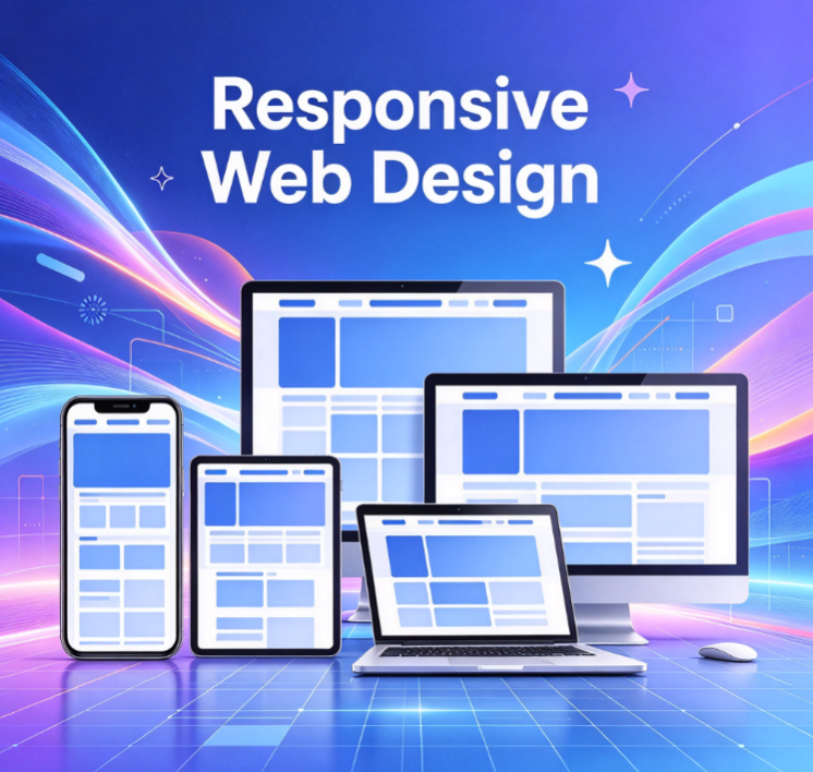
Responsive websites automatically adapt to the screens of various devices, including desktops, tablets, and smartphones. Using flexible layout technologies, page elements intelligently adjust their arrangement based on screen size. We ensure a consistent visual style and user experience (browsing and interaction) across all platforms, reducing maintenance costs. This approach is ideal for corporate websites, landing pages, online stores, and more.